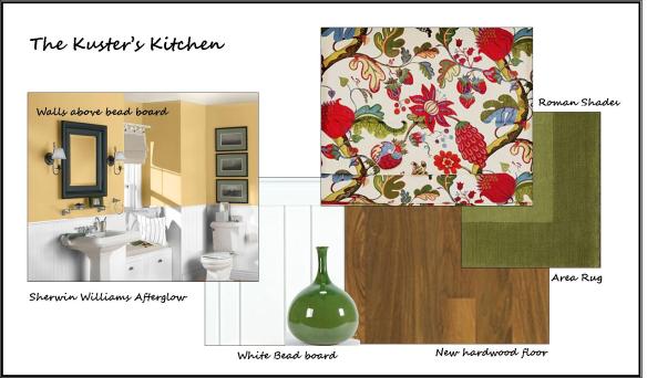
On Monday I shared the begining thoughts from a few weeks ago for a kitchen project that my friend Lori and her husband Bill are ready to begin. She had found a window treatment that she ordered off the internet to use for inspiration and we were waiting for it to come in. It came last week and over the weekend, we selected paint for the walls above the beadboard and also decided what would be the best finish for the new wood floor. Here’s the things we talked about…

The valance that Lori ordered from Pottery Barn turned out to be perfect for the kitchen windows and worked extremely well to pull together the green stove and the red coffee maker. The only suprising thing was we thought from the picture in the catalog that it had a yellow/gold color in it that we could match the walls to, but it ended up having a tinge of orange in it. After much consideration, we chose a color by Sherwin Williams called Afterglow.
I have a photo that I created on Sherwin Williams website using the actual color, but it really looks much more orange on the computer than it does in person. I think it will be a great color for the kitchen and add a fresh new feel. Especially with newly painted white beadboard and cabinets. If you ever want to get some paint ideas, you can to to the Sherwin Williams website and using the visualizer tool, you can pick a room that is most similar to yours – I picked a bathroom since it had the beadboard. Once you choose a room, you can play with different paint colors to see how it changes the look of the room. It’s a great way to get some ideas, but do not…DO NOT ever choose paint from a computer. A computer does not show you color in true form and a shade that you see online will not look remotely the same in person.
They currently have an existing wood floor in the living room that runs up next to the kitchen. It would be next to impossible to try to match it and continue the same floor into the kitchen. Rather trying to make it look the same, I recommended installing the new floor in the opposite direction and matching the dark pegs that are part of their current wood floor which has a light colored finish. Their living room floor looks like this…

See the round dark pegs? I’m thinking that if they chose a wood floor for the kitchen with a stain color similar to the stain on the pegs, that it will be a smooth transition. They agreed.
We also discussed how the colors will go with the rest of the areas that adjoin to the kitchen. This is where having a whole house plan comes into play. Since they want to continue the olive green color in the kitchen and solariam, the colors work well. The green will be a common thread in each area which will create a nice flow from room to room.
Lori showed me a picture that she bought and said she absolutely LOVES it. I loved it as well, and I think the apple itself goes really well with the roman shades and walls, but…I think that the background is just a little too much for valance. I asked her what she really loved about it, and she said the apple. With that in mind, she’s going to keep her eye out for another picture that has a large apple without the busy background. I think in the long run she’ll be much happier. If you find something that you LOVE, but it doesn’t quite work, figure out what it is that you love about and maybe you can find something else that will work even better. Here’s a photo of the picture she bought with the fabric below it…


What do you think? The next step is for Lori and Bill to dive in with painting the cabinets. When they get started, I’ll make sure to post some pictures. Hopefully, it doesn’t take as long as my dining room did – haha! Come to think of it, it’s not 100% complete. I need to get moving on that 🙂
