New Carpet on the Stairs, a Confession and Solution.

The Solution


 I have a confession to make. I H-A-T-E  looking at my new carpet. Hate it. It is driving me nuts. Don’t get me wrong, I love the carpet. It has flecks of gold, creme and brown and it’s exactly what I wanted. It will hold up to traffic, feels good on my feet, doesn’t show a lick of dirt and is a great color…unless it’s next to the painted wall. Today I realized it’s the paint. It makes the carpet look ugly and it’s not ugly. It’s all about the paint.  

 Here’s the story. I have golden/yellow paint in the living area which I love, a deeper greenish gold in the entry which I hate don’t love and another shade of gold in the  dining area which is okay, although it’s a tad bright when the sun comes in. It’s complicated to explain how those three different shade got in my house, but the simple fact is I don’t like them together and I don’t like them with my carpet. I preach all the time about whole house planning and technically I have followed my plan by having all yellow/gold walls – but because they are all a different shade, they are driving me nuts. Absolutely nuts. It took the carpet to make me realize it.  

The solution. I love my woodwork, drapes, furniture (well most of it!), slate and wood floors. The paint though is a problem, but lucky for me it’s the least expensive thing to change. And even better, I found a fabulous painter who is a perfectionist, slow and inexpensive. I adore him. Sooooooo… when he finishes up a few other jobs he is going to paint my entire lower level one single color. I am so excited. It’s a perfect example of why continuity and planning ahead with a Whole House Plan is important.    

Anyway, here are some “before” shots of my stairs when we moved in and “after” showing the new carpet. Keep in mind that while the paint looks horrible with the carpet…that will not be an issue in a few months!  

Yikes! I forgot how bad it was when we first moved in! Pink wallpaper, blue carpet and inexpensive grey ceramic tile. Ouch!


We painted several years ago, pulled up the carpet, and laid a gorgeous slate floor. Love, my slate floor! Like the paint with the wood and slate, but it's just not right with the new carpet or the rest of the house. That will be changing for sure!


As I mentioned the other day, I chose to bind the edges of the carpet rather than roll them making a nice clean finished edge.


Here's a photo looking up the stairs from the landing. I know, paint is awful with the carpet. Say no more.


And here's the second set of stairs looking down the landing. It will be perfect once I get the new paint on the walls!


New carpet and a chip of the future paint! I can't wait to show you the final photo's. It will be soooooooo much better! The paint is Valspar from Lowe's


  Whoooo… I feel so much better now that I have a solution. I actually thought at first it was the carpet I hated, but thankfully, after exploring it more I realized it’s just a matter of paint. xoxoxo Amy    

Salamanders – (really Anoles or Lizards), Berries and Paint…

Happy Monday! I’m working in Florida all week and thought I’d continue my photo essays throughout the week! On Sunday, I spent a lot of time at a local hair salon under construction. We were a bit distracted along the way…   

Do you see what we saw? Hint: Look for two cute little lizards or anoles


 The thing I love about being here in Florida is yes, I get lots of work done, come up with tons of creative ideas to make new products for you, work on interesting projects etc…but most of all I see and learn so many interesting (and useful) things. It reminds me to stop, look and enjoy my surroundings each day. That’s something I don’t do nearly enough. With that said, here’s a glimpse into snapshots of my day yesterday…   

See them now? Sneaky little things arent' they?


I think it's so amazing how well this guy blends!


This is the green one before he realizes we are spying on him...I am told he is native to Florida


And the brown one after he scampered a few feet to a new branch...This one is actually a cuban anole.


But silly me steps on something crunchy sounding and he get's a little upset and telling me to back the heck up!


Apparently, Mr. Green Jeans has his friend's back...haha!


We didn't get a mile down the road before the car suddenly stops and my friend jumps out of the car. I look to my right and this what I see...


And straight ahead I see this... (that's Margie who I'm staying with this week)


And soon she shows me this...mulberries! They are delicious. Perfect for a quick road side snack!


This is why it's always a good idea to keep some wipes in the car, haha!


Margie is helping a friend open a new Hair Salon in her community and I've been helping a bit too. The black and white tile was existing and we chose a soft purple for the walls. It's really a great color, very neutral and clients will look fabulous!


The colors are a bit off in this photo, it's all purple but looks blue...but look up at the celing...we didn't like the dark painted ceiling ending at the top and the "feel" that the high ceilings gave to the space with the light purple going all the way up. We gave new instructions to the painter to bring the eggplant ceiling down a bit...I should have photo's of that later this week! I think it will be much more intimate.


This is the shampoo and color area...we determined where existing shelving would go and came up a few creative solutions for storage...this area should be completed as well later this week!


That’s it for now…running off later this afternoon to Ikea in Ft. Lauderdale and Whole Foods. I’m will take a few photo’s along the way for you of course! Stay tuned! xoxox

Replacing Carpet and Dealing with Pet Urine on a Sub Floor

Duncan and Sami


 Several years back, I went to my first National Hardware show. I was gone not more than 4 or 5 days, but it was long enough for my youngest son Tyler to walk to the local Pet Smart, fall in love with a little black lab and talk his father into adopting him. Surprise! Of course we all promptly fell in love with Duncan.   

When Duncan came down with Lymphoma, we opted to keep him home with us and make him comfortable in his last days until he had a stroke and we knew it was time to put him to sleep – as hard as it was…it was the right thing to do.    

Sami went from the deck, to the garage, to the basement, to run of the house in less than 24 hours.


A few months before Duncan died, Sami showed up on our deck the night before a cold Halloween with a broken tail and homeless. Of course she promptly wormed her way into the house and our hearts. Apparently we are easy.   

The  reality of the situation, is when Duncan was dying he had frequent accidents in our study and hallway on the third floor. Although we worked to get the stains out, we never could completely get rid of the smell. Even worse, Sami decided it was an alternative location for her to go as well.   

This week we are replacing the carpet. Concerned that the urine had reached the sub-floor, I wanted to make sure that the smell didn’t come back. Our carpet installer recommended pulling up carpet in the stained areas a few days before they came and sealing them with Kilz. Apparently, one of their products seals in stains AND odors such as those from pets and fires; he recommended that we seal the floors 48 hours before they come to install the carpet, so we did.   

Make sure you get the one that says "Seals in Odors".


The guys pulled up the carpet this weekend and I went to Lowes. I have to tell you that I read the label of every single Kilz product because the one that seals ODORS is oil based. I HATE oil based paint. I hate it because it’s non-forgiving when it drips and if we are being honest here…I drip, and yes I dripped this time as well. I hate it because it ALWAYS gets on my clothes…and yes, it did this time too…and my shoes, slippers to be specific.  Thank goodness I took my crocs off. I just hate oil based paint. But, after spending a half an hour reading labels, I realized I was getting oil based Kilz for $19.99, and picked up some eco friendly mineral spirits to go with it.   

My other half, Mr. 1-800-junk from last week, thought we only needed a quart, but because 1) I thought we needed a gallon 2) I was doing the painting (and didn’t want to run to the store again), and 3)  I knew I was right…haha!, I bought a gallon. Turns out that was a good idea (cough,cough) because the sub floor absorbed the paint very quickly. Note to self: remind husband I was right 🙂   

Here’s the two areas I sealed…   

This is the Study...I painted it several years ago and stenciled my favorite quote. We have plans to relocate a ceiling fan to this room. I almost don't want to post this photo because of this light. Yuk. It was here when we moved in.


This hall is about 20 feet long and has doorways to the stairs going down, our master bedroom, a bath, and two bedrooms. Oh, also an elevator...how crazy is that? It's great for laundry and bags filled to go to Goodwill 🙂


Here's the study with the floor sealed. It wasn't rocket science. I just made sure to cover up the stains and did the areas around them for good measure!


It really was easy to do. The floor is now officially sealed, has 48 hours to dry completely and carpet is coming on Wednesday…yay!   

PS. House is a wreck, but in a good way…lots of areas are getting thinned out and cleaned up! I will have some before and after carpet photo’s to share later this week! I’m going to busy after work every night this week I think! xoxoxo Amy

Decorating And Design Questions Answered

Do you have a decorating question? I'd love to answer yours!


I love to answer Decorating and Design Questions…I don’t know why, I just do. There’s always a special twist or a question I haven’t had before and I enjoy finding a solution or offering advice. I have several Ask Amy questions to catch up on, but yesterday I tackled a handful!  

A few fun one’s lately included Teisha asking if I could come organize her house after I did mine, but I pretty much told her I may not be fully functional by the time I complete mine….haha! Calgon…come take me away 🙂  I also had a few things to say about men and pink to Aime over at mammaloves, hopefully I didn’t offend any of my male readers, but seriously, do you really think most men are even going to notice a touch of pink here and there? I don’t think my guys would! Now mess with the TV and THAT’s a different story!  

To see all my words of wisdom,  visit this link  Have a Decorating Question? Ask Away! to see most of the design questions I’ve answered over the last couple of years. I still have a few to  answer, but sit down when you have time and explore. Perhaps you’ll find the answer to a question you have. I’d love to hear if you agree or disagree with my thoughts – who knows, together we might find an even better solution!  Enjoy! xoxoxo Amy  

The Two Week Re-Do

What do you think I can get done around my house in two weeks, working only nights and weekends? I only have 3 weekend days and 9 week nights as I am going to Columbus next Saturday for a meeting/fish fry and will be driving to Columbus to up a house guest at the airport on the 24th. Yikes!

As you may know, I have declared that I will have my house organized top to bottom by the end of the year. I also have some serious decorating to do along the way as I have put my house on hold for way to long to start a business.  As I set these goals in January, I thought I had a year to get a lot of this done, but a very good friend of mine who I went to Butterfly World with a month or so ago, has decided to meet me in Columbus for the Spring game on the 24th and come visit that night.  To say I am in panic mode is an understatement, although I have to say I am very excited about her visit! It’s not that she won’t love me if it’s not done, it’s just that she’s never been to my house and I want it at least semi-done. This is going to make me get some serious stuff done or at the very least started. I figured I would just go ahead and share it with you along the way…the good, the bad and the ugly.

Some things need to get done so that I have room for other things, so if they seem like silly things, there is a reason behind it. Here’s some of my to do list:

  • Find a place to store my daughters stuff. She moved back in for a bit and has lot to put away. I need to find a place for it.
  • Work a bit on the garage and pantry so I have room for things above.
  • Figure out a color scheme and inspiration for the two bedrooms. Will not have time to paint, but need to have a plan. 
  • Select carpet for two bedrooms, stairs, a hallway and study and schedule a measure.
  • Tear up the old and seal the plywood floor. A beloved dog of ours died and had a bit of a potty problem in his last days. Quite sad and very yucky.
  • Get the carpet installed by the 22nd.
  • Schedule a painter for April – need to get carpet laid first. More on that later.
  • Clean out the two bedrooms and study.
  • Make sure the Bathroom is ready for a guest.
  • Clean…that will happen along the way.
  • Find a table to go with my new chairs for my new cocktail area.

I can tell you that without the paint, it won’t be finished in two weeks, but the new carpet will make a huge difference. Stay tuned, I’ll be posting updates, photo’s and thoughts for the next two weeks. It’s getting a little crazy around here, haha! xoxox Amy

Adding a Feminine Touch to a Contemporary Bedroom

I know...it's not a bedroom, but this photo from Houzz is a perfect example of adding a feminine touch to a contemporary styled room. Pink is traditionally a girly girl color and the chandelier is so glam - seriously...what gal wouldn't want to surround herself with a bit of sparkle along with tones of pink, creme and gray?


Over the weekend a reader asked the question…”How do I find a style that I am okay with now that my husband passed away? Can I make my bedroom more feminine while leaving a bit of my late husbands touch – he was into contemporary? First off…I am so sorry for you loss, it must be very difficult and I’m glad you are diving into a decorating project 🙂    

To answer your question, I say absolutely! I am not a fan of strictly following a particular style – how boring would that be?  Keeping your husband’s contemporary style, yet adding a few feminine touches of your own is a great idea. My bet is it will become a room you really love to spend time in. Here are some simple guidelines and tips for planning your room.   


  1. Settle in with a cup of tea and explore some design magazines and visit online sites such as Houzz, Elle Decor or Better Homes and Gardens. Clip or print photo’s of things that you catch your eye.
  2. Take inventory of your bedroom and identify any contemporary items that you wish to use in your bedroom.
  3. Select a photo or two the from ones you found in step one to use as an inspiration picture for your project. Take some time to identify what you like about each photo. Is it a pattern, paint color, texture, the accessories, etc…?
  4. Choose a color scheme of 2 or 3 colors that work well with the pieces you have chosen to keep and that reflect your inspiration photo. Tip: Using colors that are traditionally feminine such as pink or lavender will definitely get you going in the right direction.
  5. Use your colors to tie everything together, making sure to equally distribute the contemporary and any non-contemporary pieces throughout the room.
  6. Combine a contemporary item with a softer more feminine accessory!
  7. Experiment a bit and stay true to what feels good…usually your first gut reaction is right. There are no right or wrong decorating rules – just rules of thumb…it’s all about not being afraid to experiment and keeping it fun. If it feels good to you… it’s right!

Here’s a few photo’s I found over at Houzz with some thoughts to get you started… Good luck!    

Top a sleek contemporary table with beloved worn books and an antique teacup and saucer for a welcoming cozy touch


A bouquet of flowers and a delicate throw at the end of the bed is an easy way to add a feminine touch to your bedroom


Pardon me while I get distracted...would you EVER leave this room?


Want to keep it all contemporary? Adding abstract art with heart-shaped lips or lineal flowers is a great way to add a female touch


Select textures with a decidedly feminine feel such as satin or lace to soften the hard lines of a contemporary room


Good luck with your room and let us know how it turns out 🙂 xoxoxox Amy

All About Ceiling Medallions

Close up Medallion

Look up at the ceiling.   

Is there anything special up there? The surface that everyone seems to forget when decorating is the ceiling and my bet is you’re looking at one that’s been forgotten as well. Let’s face it, we give our full attention to selecting the flooring, choosing treatments for the walls and windows, but more often than not, we forget about the ceiling. Oh yes, we choose lovely lighting and hopefully we’ve chosen it for both beauty and function – but what about beyond the lighting?  

There’s endless decor ideas for ceilings such as faux painting, stenciled designs, tin tiles and more; typically, we just don’t think to use them. One of my favorites accents to place a ceiling medallion above a chandelier. Medallions are affordable,  available in all shapes and sizes and can be hung as-is or even better; painted.  

I have a medallion sitting in the corner of my dining room that I’ll post about when I get around to finishing it, but in the meantime I photographed a project that my friend painted one day when I was visiting. Here’s some helpful tips for selecting, painting and hanging a ceiling medallion.  

Selecting a Medallion. Medallions come in all shapes and sizes. Your local home depot or Lowe’s, will  offer a choice of assorted white medallions which be mounted as is or hand painted to match your trim or decor. You can also find medallions in a bronzed finish to match your chandelier. They can range from $18.00 to $200.00 and up. Some are very lightweight and others are heavier. Once hung, you it’s pretty difficult to know if it was inexpensive or not. It’s about choosing the style and finish that is right for you.  

Classic Medallion

You can get a simple classic design like this..


ornate medallion

Or a traditional, ornate style such as this...


Bronze Medallion

Here's a medallion finished in bronze...


Dome Medallion

Another that's dome styled


Giclee Bronze Ceiling Medallion

Giclee bronze medallion


Wrought Iron Medallion

Wrought iron


Above are just a few of the many styles and finishes available. The photo’s are from LampsUSA and additionally, you can  find lots of online sources.  

Once you decide the style you prefer, size is your next concern. Now it’s all about proportion. If you have a larger chandelier, you want a medallion that is big enough to provide balance – too small, and it will look out-of-place. The reverse goes if you have a small chandelier.  You want to select a medallion that is proportional in size – anything too big will over power a smaller light fixture. I’ve been referring to chandeliers, but you can really use medallions with many styles of  lighting fixtures; even ceiling fans.  According to LampsUSA, which is where the medallions above are from, here are some thoughts on sizing:  

Sizing rules of thumb:  

  • A ceiling medallion should be two-thirds the diameter of the chandelier.
  • Larger rooms and higher ceilings can accommodate larger ceiling medallions.
  • For a typical dining room with an 8′ – 9′ ceiling, a medallion that is 18″ – 26″ in diameter will usually work well.
  • 20″ – 28″ ceiling medallions work well with 52″ ceiling fans.

Coming up: Follow along as my friend paints a medallion for her home to complement the chandelier below…  

Chandelier

This Chandelier is going to get a Painted Medallion...


Inspiration Board for a Chocolate and Green Bedroom

Inspiration board for Mark

Note: Double click image to enlarge

I was at a graduation party this past weekend and ran into a good  high school friend of ours – Mark aka “Wooley”.  The recreational area where the party was held had a really nice red accent wall and Mark said he was thinking about using that shade in his master bedroom. He asked what my opinion was and since I shamefully had not been to see his new home (which he has had for a year!) I offered to stop by on Sunday and take a look.  I should add that I’ve heard Sunday’s in the summer at Mark’s include cocktails poolside, so it was not a hard sell!
Although I loved the red that he was considering, I felt that it blended too well with his furniture and suggested that he went with something that enhancedthe wood, rather than compete with it. His furniture consisted of a rich cherry sled style bed, large armoire and dresser. Additionally, he had splurged and purchased a really beautiful deep chocolate Hotel Collection bedding set that had a tailored black stripe as accent … nice job Mark 🙂
As I thumbed through a paint deck, my initial thought was to go with a blue/chocolate scheme, but Mark is a  bachelor and I was afraid the blue would go more feminine than masculine. I also should add that he is a bit obsessed with golf and once I saw the green, it  just seemed like a natural choice! I chose Sherwin Williams Rural Green and created the inspirational board pictured above. He also has the option of adding a little splash of orange down the line, which I think he would like as well.
The inspiration board is about clean lines, fresh accents and a peacefull elements for relaxing and romance – Mark should like that last one! What do you think?
Oh, and typically, I would list where everything is from, but that’s easy today…it’s all from Z-Gallery. Hmmm…do you think I like that store? And best of all there’s a 20% off accessories sale going on right now – gotta love that!

Step Five: Adding a Wood Floor- a Kitchen on a Budget

door to porch      
After Photo: New Wood Floor


 The Kuster’s are just about finished with their kitchen remodel, which means I’ll do the full unveiling soon, but in the meantime, here’s a sneak preview of the new wood floor. They used prefinished planks they found at Sam’s that fit their budget and their needs. I’ll talk more about wood floors in my next post, because I’m going to see it in person tomorrow evening and want to take some close of photo’s to show you what I’m talking about – I like visuals 🙂

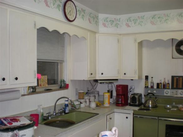
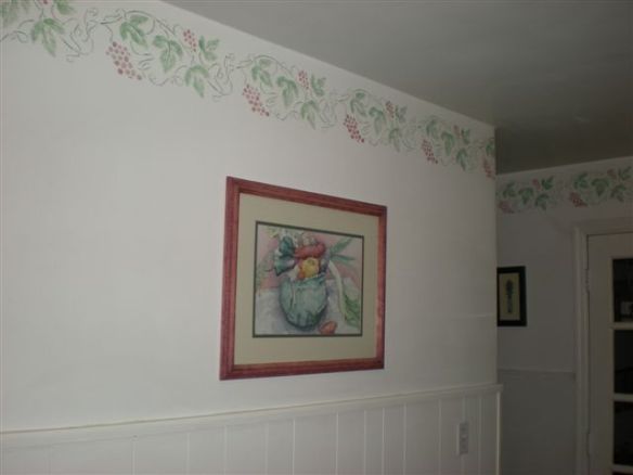
Below is the before picture – amazing what a difference a new coat of paint and a DIY wood floor can make! Stay tuned for the final pictures…

Before Photo: Old paint and Flooring

Step Four: Valances and Wall Art – Kitchen on a Budget

 
Painted Wall and Cabinets

If you’ve been following the Redo of the Kuster’s Kitchen, I’m happy to report that the painting is done and it looks fabulous! As of the last update, they had painted the walls and beadboard, but still had the cabinets to complete. It’s amazing what a little paint can do!

Before Photo
Before Photo

 Lori found some apple pictures that she really liked. Remember the original apple photo that she loved? I think the new one’s below work much better – don’t you?

dscn0434
Wall and Beadboard Painted with New Artwork
Wall before Paint and Art
Before Photo

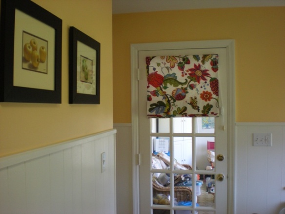
Additionally, they hung the window treatments on the window and door Doesn’t the valance on the door look great with the photo’s? Lori purchased an extra one so we can make a custom valance to go over the eating area. I’ll take lots of photo’s when we do that in the next few weeks!

new-pictures
Valance on Door

What’s up next? Besides hanging the chandelier and making the additional valances, the final project is to lay the wood floor. They found prefinished laminated flooring at Sam’s Club and hope to have it finished in the next few weeks! I can’t wait to see that! I know…I’m holding out and you haven’t seen all the areas, but I wanted to save the best for last! Once the wood floor is installed, we’ll do a full unveiling…Stay tuned!

Step Two: Choosing Finishes – a Kitchen on a Budget

paint-selections

On Monday I shared the begining thoughts from a few weeks ago  for a kitchen project that my friend Lori and her husband Bill are ready to begin. She had found a window treatment that she ordered off the internet to use for inspiration and we were waiting for it to come in. It came last week and over the weekend, we selected paint for the walls above the beadboard and also decided what would be the best finish for the new wood floor. Here’s the things we talked about…

window-roman-shade

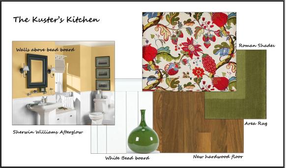
The valance that Lori ordered from Pottery Barn turned out to be perfect for the kitchen windows and worked extremely well to pull together the green stove and the red coffee maker. The only suprising thing was we thought from the picture in the catalog that it had a yellow/gold color in it that we could match the walls to, but it ended up having a tinge of orange in it. After much consideration, we chose a color by Sherwin Williams called Afterglow.

I have a photo that I created on Sherwin Williams website using the actual color, but it really looks much more orange on the computer than it does in person. I think it will be a great color for the kitchen and add a fresh new feel. Especially with newly painted white beadboard and cabinets. If you ever want to get some paint ideas, you can to to the Sherwin Williams website and using the visualizer tool, you can pick a room that is most similar to yours – I picked a bathroom since it had the beadboard. Once you choose a room, you can play with different paint colors to see how it changes the look of the room. It’s a great way to get some ideas, but do not…DO NOT ever choose paint from a computer. A computer does not show you color in true form and a shade that you see online will not look remotely the same in person.

They currently have an existing wood floor in the living room that runs up next to the kitchen. It would be next to impossible to try to match it and continue the same floor into the kitchen. Rather trying to make it look the same, I recommended  installing the new floor in the opposite direction and matching the dark pegs that are part of their current wood floor which has a light colored finish. Their living room floor looks like this…

existing-wood-floor

See the round dark pegs? I’m thinking that if they chose a wood floor for the kitchen with a stain color similar to the stain on the pegs, that it will be a smooth transition. They agreed.

We also discussed how the colors will go with the rest of the areas that adjoin to the kitchen. This is where having a whole house plan comes into play. Since they want to continue the olive green color in the kitchen and solariam, the colors work well. The green will be a common thread in each area which will create a nice flow from room to room.

Lori showed me a picture that she bought and said she absolutely LOVES it. I loved it as well, and I think the apple itself goes really well with the roman shades and walls, but…I think that the background is just a little too much for valance. I asked her what she really loved about it, and she said the apple. With that in mind, she’s going to keep her eye out for another picture that has a large apple without the busy background. I think in the long run she’ll be much happier. If you find something that you LOVE, but it doesn’t quite work, figure out what it is that you love about and maybe you can find something else that will work even better. Here’s a photo of the picture she bought with the fabric below it…

dscn0355

window-roman-shade-cropped

 What do you think?  The next step is for Lori and Bill to dive in with painting the cabinets. When they get started, I’ll make sure to post some pictures. Hopefully, it doesn’t take as long as my dining room did – haha! Come to think of it,  it’s not 100% complete. I need to get moving on that 🙂